
雖然iPhone和Android這二個都是公認相當優秀的全觸控手機,但是自己目前還是比較喜歡iPhone的介面設計,有些朋友聽到之後會問為什麼,這邊就造成自己覺得如此差別當中最關鍵影響的二點寫下來,當然可能都是一些個人喜好的問題,不過我還是把這二種系統的使用心得,把它整理起來。
1.介面的隱喻和實體的按鈕

以介面設計的人來說,能夠在介面上表達實現的功能,就盡量不依靠按鈕,所以在介面的設計上,常常會以圖形借用實體的隱喻來取代按鈕的功能(如上圖[1]的部分)。而iOS的介面算是將這種概念表達到極致,機器正面只有一個按鈕(側面還是好幾個就是了),其他的功能就要依靠軟體上的介面去實現。而Android的概念,則是將「上一頁」「選單」「首頁」和「搜尋」的主要四種功能以按鈕實現(如上圖[2]的部份)。iPhone的設計是讓實體機器的簡潔更容易達成,並且在軟體和系統設計當中將按鈕功能都介面化。而Android的設計是比較折衷,將常用功能還是獨立出來。
其實二種使用都有其優缺點,例如iPhone的過度隱喻,可能會造成使用者在遇到需要功能的時候,必須要透過學習才能了解(比如有些功能要按二次首頁鍵,或是畫面擷取需要功能鍵的搭配)。而Android則是比較傳統的手機設計模式,但是自己偶爾也會遇到在程式使用介面當中,會因為不知道該按哪個按鈕而誤擊的狀況。雖然Nexus One在機身設計上已經很簡潔了,而且自己在用過Tatoo之後也認為Android是一個很優秀的系統,不過個人還是喜歡iPhone在軟硬體設計思考上的整合性概念。
2.軟體ICON圖形的辨識和分頁設計
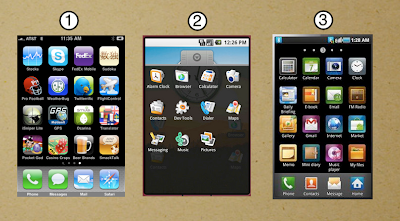
這一點應該也是個人喜好的問題,當智慧型手機內的軟體還不多的時候,二者的差異性還不大。但是當安裝的軟體開始多的時候,自己覺得會出現一個狀況,那就是Android的圖形icon形狀並不像iPhone有一個固定形狀(如上圖[1]),在遇到一堆軟體要找的時候,圖形輪廓的不規則往往干擾到閱讀icon底下的軟體名稱文字(如上圖[2])。
在桌面的部份,iPhone介面因為從頭就開始採用所有軟體以分頁模式展現,桌面的配置和整理以iTunes上使用為比較方便的方式(雖然也是後來才有的功能)。Android因為在桌面和軟體庫之間的使用是分開的,然後要在桌面新增捷徑的時候,就會再受到不規則圖形干擾。HTC Sense採用在新增桌面程式捷徑時,只有讓軟體名稱出現文字列表的方式來處理,個人覺得也並沒有很理想,因為會遇到程式名稱沒記熟還要回去軟體庫再查一遍的問題。
Samsung在i9000 Galaxy S當中(如上圖[3]),也開始將內建程式的icon改以統一形狀處理,但是不確定從AppMarket當中下載的軟體,是不是也會自動加上形狀底色。不然如果同時有固定和不規則形狀出現,其實反而是更亂,但是自行加上的底色是否會干擾到軟體icon的設計,也會是個問題。
上面這二點雖然都是小地方,但是卻影響到了一些自己對於這二個系統的評價,因為在整體介面使用思考的方向上,自己比較喜歡iPhone的部份。但是Android手機也的確是相當優秀的智慧型手機系統,跟早先推出的WM和Symbian比起來,優點是多更多,不同的設計方向或許可以吸引到不同的族群,其實只要是自己覺得好用就是好系統了,不過Android 2.2的3G to wifi功能相當吸引我,至少不用像iPhone要JB才能辦到(雖然現在JB破解都做得很簡單了)。
translate by google
2 keypoints why I like iPhone interface more than Android
While the iPhone and Android are recognized in these two very good full touch phone, but is still prefer their own iPhone interface design, and some friends would ask why, after hearing, here on the cause of them feel so different from most, The 2:00 written down, of course, may have been some personal preferences problems, but I use these two kinds of systems experience, finishing it up.
1. Interface metaphors and physical buttons
To interface design for people who can interface to achieve expression of the function buttons do not rely much as possible, so the design of the interface, often with graphic metaphors to replace the borrowing entity function button (shown above [ 1] part). The iOS interface will be the expression of this concept to the extreme, the machine front has only one button (or several side wants to), other functions must rely on the software's interface to be realized. The concept of Android, sucked "Previous" "menu", "Home" and "Search" button on the main four functions in order to achieve (as shown above [2] part).iPhone is designed to make it easier for entities to achieve simple machines, and software and system design features among the interface of the button. The Android's design is more eclectic, the common functions or independent.
Actually, two kinds of uses has advantages and disadvantages, such as over iPhone metaphor, may cause a necessary function in the face of time, must be through learning to understand (such as some functions in accordance with the second Home button, or screen captures with the need in the function key).The Android is the more traditional mobile phone design patterns, but occasionally encountered in the program their own user interface which will be because they do not know what to hit the wrong button on the situation. Although the Nexus One in the body is very simple design, and and his following in the used Tatoo think Android is a very good system, but personally, prefer to think the iPhone in the integrated hardware and software design concepts.
2. Software ICON graphic recognition and page design
This issue should also be personal preference, when the smart phone software is not much time difference between the two is not great. But when installing the software started more often, feel that a situation occurs, that is, the shape of Android's graphic icon as the iPhone does not have a fixed shape (as shown above [1]), in the face of a pile when looking for software , graphics, irregular contour are often disturbing to read icon software under the name of the text (as Figure [2]).
Part of your desktop, iPhone interfaces for all the software from scratch to begin with page mode display, desktop configuration and the order to use iTunes for the more convenient way (although only the function is later). Android as between the desktop and the software library is separate from the use of, and then add a shortcut to the desktop when it will no longer be irregular graphics interference. HTC Sense program using the new shortcut to the desktop, only to the software name appears in the text list ways to deal with individuals that are not ideal, because the program will encounter familiar names not remember the software library and then go back to check the issue again .
Samsung i9000 Galaxy S in which (as shown above [3]), also began to change built into the program icon to unify the shape processing, but not sure which to download the software from the AppMarket, is not it will automatically add the shape of background color. Otherwise, if both fixed and irregular shape, in fact the contrary is more chaotic, but on their own with the background color will interfere with the design of the software icon it will be a problem.
Although these two points above are a small place, but it affects some of their evaluation for these two systems, because the interface used to think the overall direction, and that they prefer the iPhone part. But the Android phone is very good indeed smart phone system, with the launch of WM and Symbian earlier compared it to the advantage of many more different design direction may attract different ethnic groups, in fact, is useful as long as they feel a good system, but Android 2.2 of 3G to wifi are quite appealing to me, at least not like the iPhone to JB to do (though now JB has done very well break easy).

 留言列表
留言列表